There’s a world of difference between Power BI dashboards that look impressive and ones that actually change how you run your business. The pretty ones get admired in meetings, but truly effective Power BI dashboard creation focuses on solutions that are regularly monitored because they genuinely influence what happens next. 

The distinction matters more than you might think. Most business intelligence solutions fail not because the data is wrong or the charts are ugly, but because they don’t connect the dots between information and action. They tell you what happened, but they don’t help you decide what to do about it. 

When Power BI Dashboards Actually Change Business Outcomes 

The most powerful custom Power BI dashboards share a common trait: they answer the questions that keep business owners awake at 3am. Not the questions they think they should be asking, but the ones that genuinely matter for their specific situation.

Consider a manufacturing business struggling with cash flow despite strong sales figures. Traditional Excel reports might show revenue trends and expense categories, but effective Power BI dashboard creation focuses on what they really need to see—the gap between when they invoice clients and when payments actually hit the bank. Custom reporting solutions showing aging receivables alongside cash flow projections help spot potential shortfalls weeks in advance, enabling action before problems become crises.

That’s the difference between basic reporting and comprehensive business intelligence solutions. Reporting tells you that your receivables are $150,000. Well-designed dashboards tell you that based on current aging patterns; you’ll be $30,000 short of covering next month’s payroll unless you chase three specific overdue invoices this week.

The Psychology Behind Effective Power BI Dashboard Creation

Human beings are remarkably good at ignoring information that doesn’t lead to clear action. It’s not laziness—it’s cognitive efficiency. When faced with pages of charts and tables, most business managers will glance at the headlines and move on to something they can actually do something about.

This is why professional Power BI services focus ruthlessly on decision points rather than data points. Instead of showing every possible metric, effective data visualisation tools highlight specific information that should trigger specific responses. Revenue down 15% this month? Well-designed business intelligence solutions don’t just show the decline—they break down which products, customers, or regions are driving the drop, giving you somewhere concrete to start investigating.

The best custom Power BI dashboards also understand timing. There’s no point alerting someone to a problem they can’t solve until next week, but there’s enormous value in highlighting issues that need attention right now. This is where automated alerts and exception reporting become powerful—not because they eliminate human judgment, but because they focus it on the decisions that matter most.

Beyond Pretty Charts: Professional Power BI Dashboard Creation

Visual appeal matters, but not for the reasons most people think. Well-designed reporting solutions aren’t effective because they look good—they’re effective because they make complex information instantly understandable. The goal isn’t to impress visitors in the boardroom; it’s to help busy managers make better decisions faster.

Effective Power BI dashboard creation follows the way people actually consume information under pressure. The most critical metrics need to be visible at a glance, ideally with clear indicators of whether things are tracking well or need attention. Detailed information should be available but not overwhelming—accessible through drilling down rather than cluttering the main view.

Context is everything in business intelligence solutions. Showing this month’s sales figure is interesting. Showing this month’s sales compared to target, last month, and the same month last year starts to tell a story. Adding trends, seasonal patterns, and leading indicators transforms data into insight.

Common Power BI Dashboard Mistakes That Kill Decision-Making

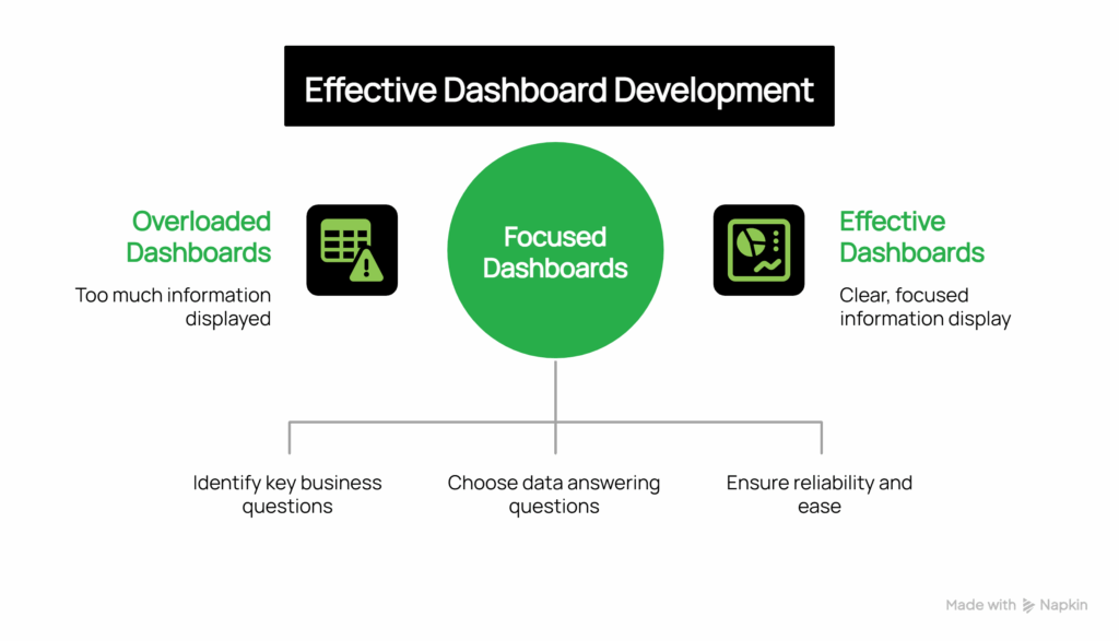
The most common mistake in dashboard development is trying to put everything on one screen. The “single pane of glass” approach sounds logical until you realise that different decisions require different information. A sales manager needs to see pipeline health and conversion rates. A CFO needs cash flow and profitability trends. An operations manager needs capacity utilisation and quality metrics. Custom solutions trying to serve all these needs end up serving none of them well.

Don’t fall into the trap of building data visualisation tools around the data you have rather than the decisions you need to make. Just because your CRM captures 47 different fields doesn’t mean they all belong on your sales dashboard. The most professional Power BI services start with an important business question—”Are we on track to hit our quarterly target?”—then work backwards to identify which specific data points help answer that question.

Technical complexity can also undermine effectiveness. Reporting solutions that take forever to load, require special training to interpret, or break every time someone updates the underlying data quickly become abandoned. The most successful business intelligence solutions prioritise reliability and simplicity over sophistication.


Power Bi Dashboards That Drive Business Decisions Visual Selection

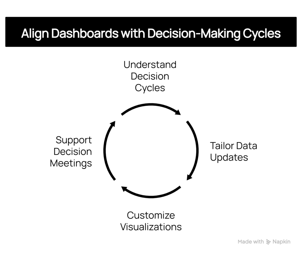
Aligning Power BI Dashboards with Your Decision-Making Cycles

Decision-making cycles vary across businesses, and effective dashboard development should reflect these patterns. A retail business might require daily inventory updates but only weekly sales trend analysis. A professional services firm might focus on monthly utilisation rates while needing real-time project status updates.

The key is understanding how and when decisions are made within your organisation. If your management team meets every Tuesday morning to review performance, your reporting solutions should support that cycle—with data that’s current as of Monday night and focused on issues that can be addressed in the coming week.

Likewise, individual managers need custom data visualisation tools that align with their daily workflow. A warehouse manager checking stock levels at 6am needs different information, presented differently, than a marketing director reviewing campaign performance during afternoon planning sessions.           

Power Bi Dashboards That Drive Business Decisions Visual Selection (3)

The Strategic Impact of Business Intelligence Solutions

When Power BI dashboards are designed around decision-making rather than data display, they start to change how businesses operate. Managers become more proactive because they can spot trends early. Teams become more aligned because everyone’s looking at the same key metrics. Strategic planning becomes more grounded because it’s based on clear, current information rather than gut feel and outdated reports.

Perhaps most importantly, effective business intelligence solutions help businesses learn about themselves. Patterns emerge that weren’t visible in traditional reporting. Correlations become apparent between seemingly unrelated activities. Over time, this deeper understanding leads to better strategy and more confident decision-making.

The transformation isn’t just about having better information—it’s about developing a more systematic, evidence-based approach to running the business through professional Power BI dashboard creation.

Ready to explore how custom Power BI dashboards could transform decision-making in your business? Our consulting services specialise in creating intelligent solutions that connect data to action, helping Australian businesses make faster, better-informed decisions.